


And so the day came, when some 5% of nursing homes in the country were branded with their own “Scarlet Letter.”
They would be those who were cited for abuse causing actual harm in the last year or two instances of abuse potentially causing harm over the past two years.
They had little more than two weeks notice that this brand of shame would be coming, and the provider community complained loudly about both the propriety and the mixed message of the icon itself. This writer led the chorus on the latter point.
So what did we learn Wednesday when the curtain rose on this unnecessarily dramatic sideshow? Two things. Beyond the absence of humility to admit that the particular icon chosen was inappropriate — or at least was inappropriately unveiled without a better visual example — we learned that the Centers for Medicare & Medicaid Services has taken some pains to explain what it is trying to do. How much of that was factored in because of the ruckus of the last two weeks, we’ll never know.
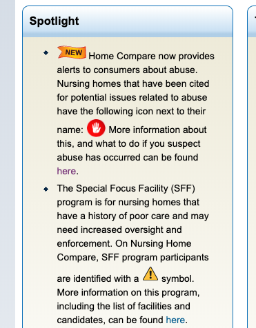
But we do know this: The open-palmed “stop” icon in a red circle appears after the facility’s name and is not at the very start of the entry, which keeps it out of speed-skimming territory. There is also a prominent explanation on the Nursing Home Compare website search page, which does a credible job of explaining what consumers should do if they’re interested in a facility that bears this icon. It mentions the facility has been involved with “potential issues related to abuse” (expect consumer advocates to ask for that language to be sharpened) and directs interested readers to another page for further explanation.
And right below that explanation is the exclamation-point icon in a yellow triangle that signifies the even rarer, poorer-performing members of the Special Focus Facility group. Some facilities show both icons, which isn’t all that surprising.
It seems part of CMS’ problem might be that it was already using the icon it should be employing for the abuse “warning.” Let’s review the rules of the road: Yellow means warning. Red, on the other hand, means stop and take a long look. And nobody can deny SFF members have earned, and deserve, a real long look. They achieve their inclusion on the list the old-fashioned way: They earn it.
The “abuse” list, on the other hand, is more slippery, as providers will undoubtedly continue to point out.
Time after time at last week’s American Health Care Association annual meeting, I heard nurses or other leaders fretting about D citations (those written for “potential harm”). Sometimes, for example, they’re given if one resident jostles another, an incident often quickly forgotten by both parties and not often thrusting anyone in danger.
Until now, that is. Now facilities that receive two D’s in two years — for any of a variety of reasons, many of them subjective — could be looking at the ominous red online icon for a year.
Overall, the verdict seems to be: CMS made a decision and since the agency is your lifeline, you have to suck it up and deal with it. Any comment period was purely unofficial and unplanned by them. Some attempts were made to explain, if not show, what was coming. But those might have done more to heighten some anxieties than enlighten or ease worries.
There actually might be two more lessons learned from the past few weeks. (I won’t say “final” lesson because I have a feeling there will be more coming in the future.) One, if federal regulators decide they want to do something to get your attention, they have numerous powerful ways to do it and they’re clearly not afraid to use them and ask questions later.
The other? If you think you’re being wronged, in the long run it’s better to raise your voice and be ignored than to be strong-armed and shamed in sullen silence.
Follow Executive Editor James M. Berklan @JimBerklan.


